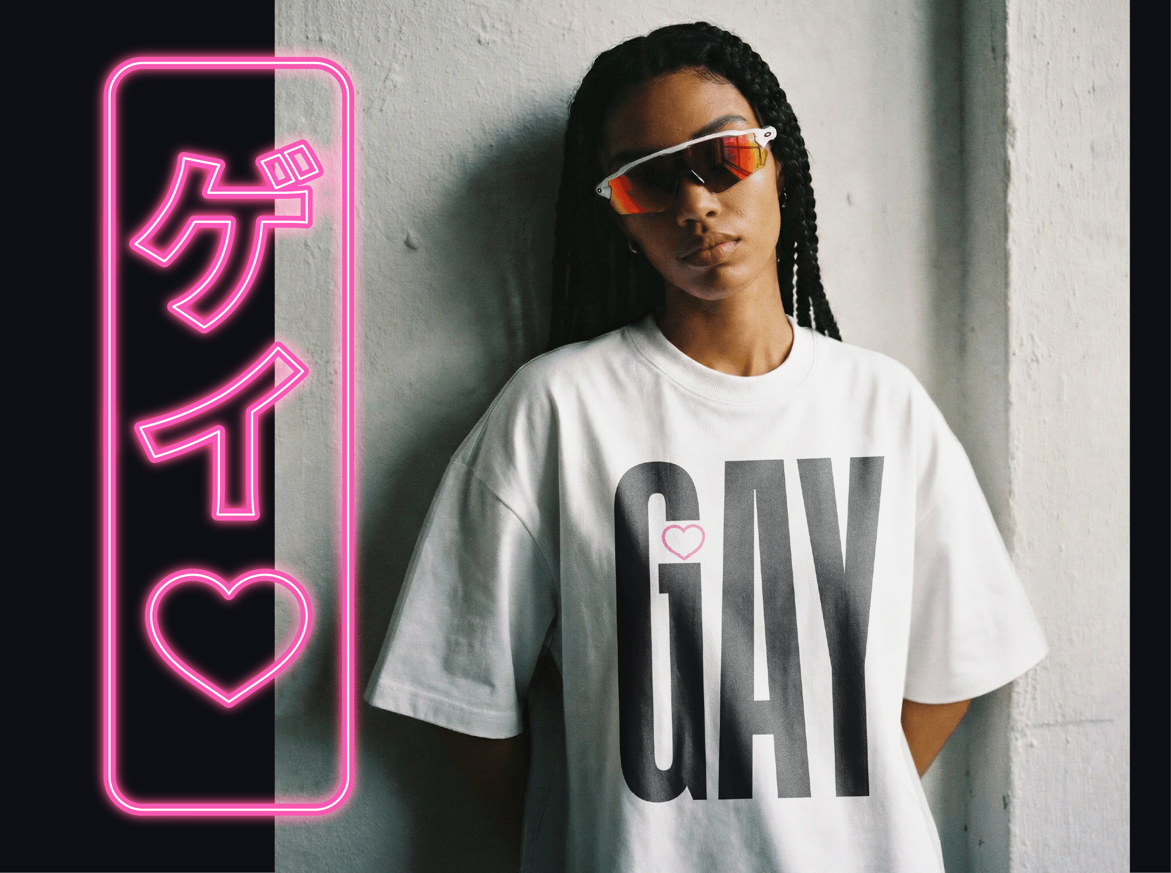
Nina Fuji After Dark Merch Design
About the project
Date:
Services:
Merch Design
Illustration
Print Production

Concepting
I pitched three concepts, each built around a different piece of Nina's identity. The first to be released leaned into the "After Dark" side of her branding with bold, oversized wordmarks, including accurate Japanese translations (ゲイ, レズビアン), and playing with neon-sign-style vertical type. A third direction, Girls Girls Girls, came out of round two: black tees, hot pink type, Tokyo-neon-sign inspiration, and a cheeky kiss emoji worked into the wordmark itself.
Outcome
The stacked "GIRLS GIRLS GIRLS" wordmark — solid pink text, kiss emoji tucked into the second line — became one of the standout pieces from the launch. The project went well enough that Nina made me her go-to for design going forward, and we've stayed in active conversation since about guide revisions, physical print copies, and future merch lines.